Installation Mock-Up
Below are mock ups of my vision for the exhibition installation of my work exploring how disinformation spread during the 2019/2020 Australian Bushfires.
These are still WIPs, naturally.
As I have done previously, the ‘photographs’ in these mock-ups have been AI generated for the storyboard. I will shoot these images next year - at this stage they
provide a scaffold for the trajectory of the work.
The videos and layout need much development, but I hope this provides a good insight into my thinking and planning at this stage.
I will provide brief notes below the section mock ups, to outline my ideas and some critical insights i’ve developed whilst making these.
----------------------------------------------

(click on video to see playback)
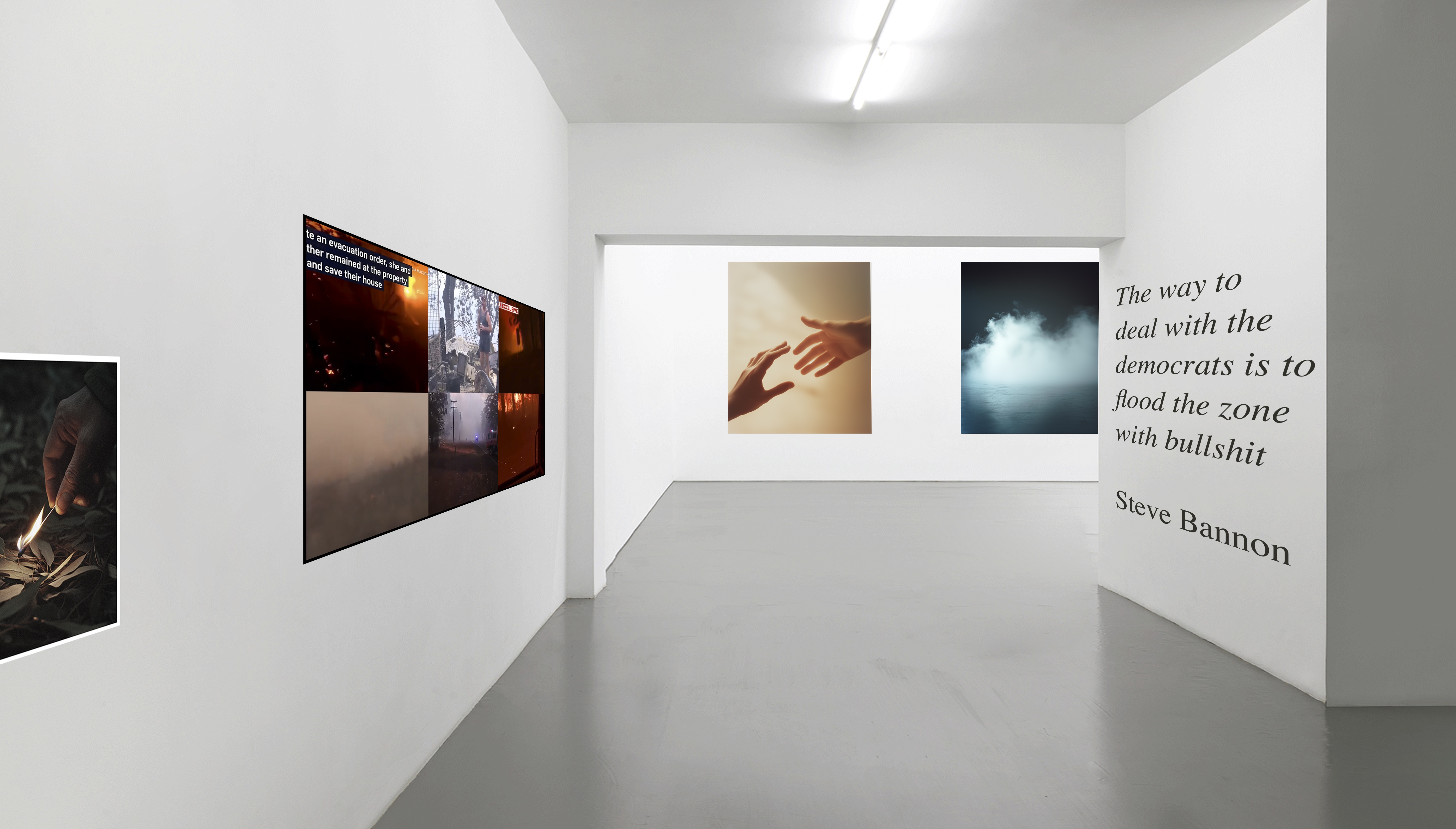
I want to begin the exhibition with an ‘affective opener’ - something that sparks visceral engagement with the subject matter.
Here I have mocked up a sequence that presents material related to those who passed away during the Bushfires, serving as a reminder of the
serious consequences underlying this issue.
I have used a survivor testimony pulled from an ABC interview here, but I plan on travelling and making this video myself.
The photo on the left (fridge with photos on it) is a mock up of a more ‘straight forward’ documentary image -> something made in a survivors house picturing memories of someone
who had passed away. Whilst the rest of the install has ‘interpretive images’, I have plans for a thread of ‘straight forward’ documentary images, similar
to my interior shot of the think tank office shown in previous meetings and WIP presentations. These would provide more direct documentation of my subject matter.
Important here also is the image visible in the next room - I want to use ‘lines of sight’ in the exhibition layout to encourage visitors to move
gradually through the exhibition space, engaging with the content at their own pace.
The ‘affective opener’ approch and ‘lines of sight’ are two ways I am experimenting with addressing the issue of ‘cognitive load’ in this work,
where too much text or ‘information’ could make the viewer disengage.
----------------------------------------------
(click to play)
This section continues from the last, presenting an introduction to the work and the visualisation tool.
The video needs work - right now it is more of a ‘video essay’. I want to develop a more distinct ‘operative model’, similar to Forensic Architecture, where
the data visualisation is animated to demonstrate my exploration of the subject matter.
The narration sets up a couple things - what I want the focus of the work to be (how the arson narrative spread), and embedding a reflexive narration
of the necessity to produce new visual tools to unpack the subject matter.
The wall text aims to connect with an historic aspect that relates to the subject matter -> the flood of news in ‘the zone’ requires new tools to unpack it.
The lead in image on the left is an ‘interpretive image’, which aims to connect with conceptual aspects of the work.
Here, I seek to invisage this false idea of ‘arson’, hoping to create a throughline in the work where the literal act of ‘arson’ is analogised to the spreading of disinformation.
There are also two images in the line of sight into the next room. They aim to analogise to the idea of a fog or cloud of content that ‘obscures fact’,
whilst also aiming to connect with the smoke and arson throughline.
The hands aim to speak to the idea of providing a ‘helping hand’ through uncertainty -> news media creates uncertainty then posits a way through - a simple,
inaccurate explanation -> climate change is a hoax and ‘arsonists’ caused the bushfires.
Interpretive images are another way that I seek to manage ‘cognitive load’, by providing breaks between works in the installation that have a lot of information (e.g. the videos)
and by visually encapsulating core concepts or suggesting connections between the materials shown.


----------------------------------------------

(click to play)
This section shows an experimentation in reflexively narrating my own process of making the work.
This is an approach I am particular interested in, as I see it connecting subject, methodology and history.
In this case, I describe the issue of training our Large Language Model to classify ‘reported speech’ in news articles.
This issue arose organically, where the prevalence of ‘neutral reporting’ and ‘false balance’ created an impediment to
developing methodologies to analyse denialist rhetoric. This impediment itself reflects the very nature of the subject I am
trying to unpack, where uncertainty is engendered through ‘bothsideism’ in climate reporting.
I have also placed a large wall text here - an excerpt from the American Petroleum Institute’s ‘Climate Communications Action Plan’
which explains that:
Victory Will be Achieved When...
Media coverage reflects balance on climate science and recognition of the validity of viewpoints that challenge the current ‘conventional wisdom’
Thus, I aim to connect both my methodological developments and the spread of disinformation during the bushfires to documented
deliberate strategies of ‘dark epistemology’.
----------------------------------------------
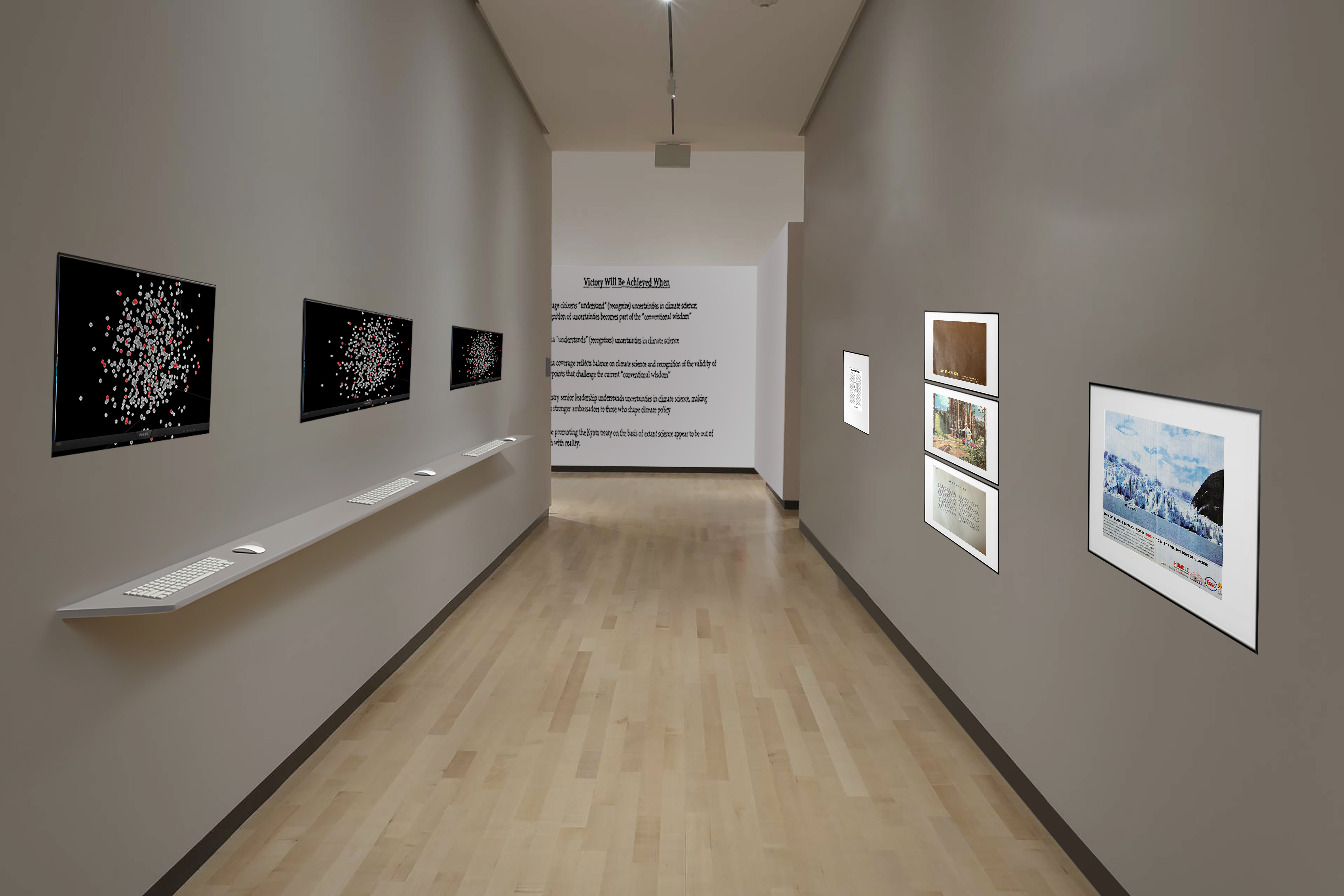
This corridor shows computers on the left where viewers can interact with ‘Lookglass’, exploring semantic strategies within articles on
the bushfires.
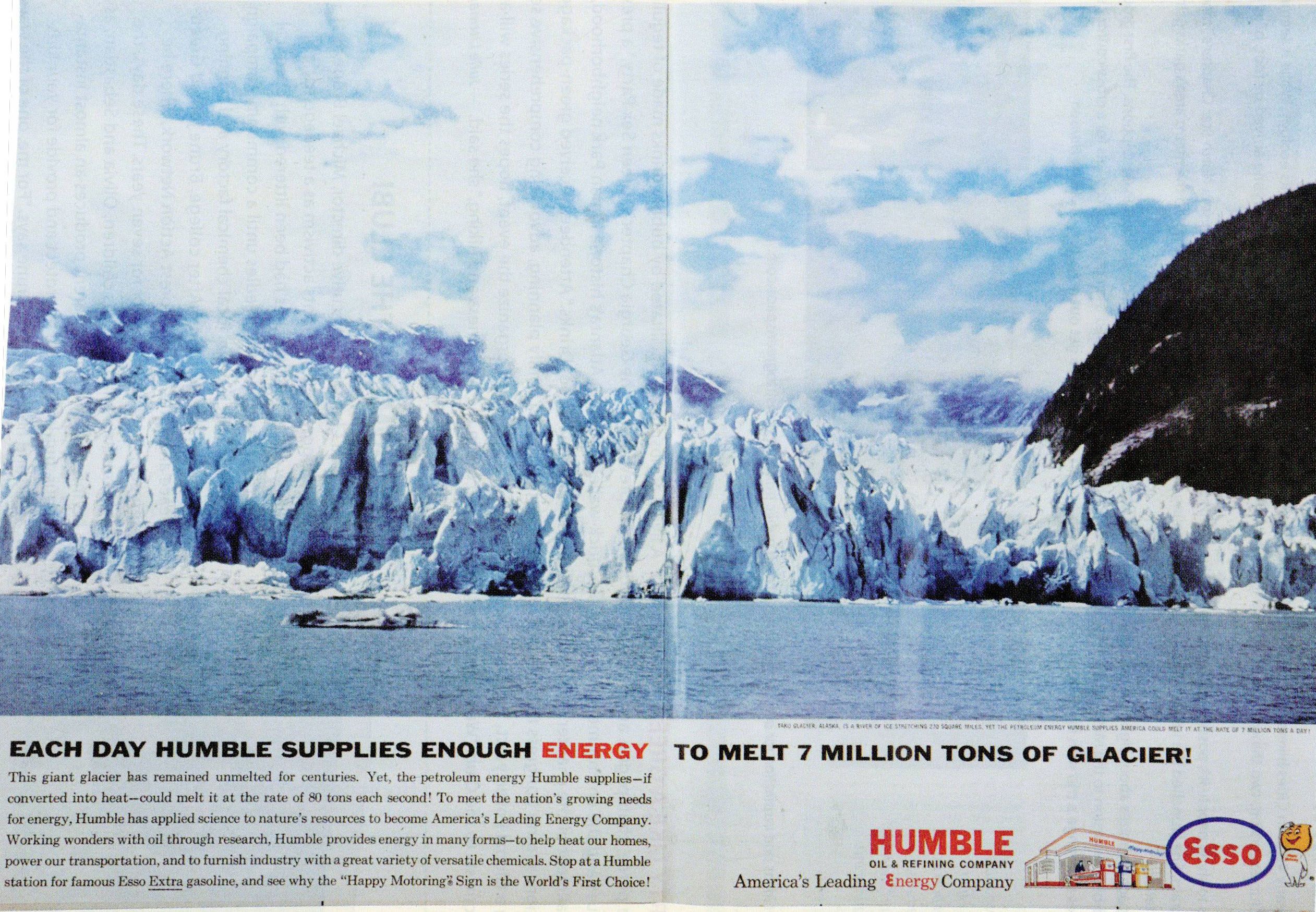
On the right are archival public communications materials from fossil fuel companies. My aim here is to juxtapose how strategies of
spreading denialism have changed over time, from more overt strategies to more insidious ones, reflecting also the shift from physical
to online media.
See below for close up images of these materials (note: I currently own original copies of all of these except the Exxon newspaper editorial).
Again, ‘line of sight’ is important here. The API document remains in view in the distance, allowing viewers to make on-going connections
between materials throughout the installation. I would like to develop a layered exhibition design where multiple lines of sight are possible
at different stages.


----------------------------------------------
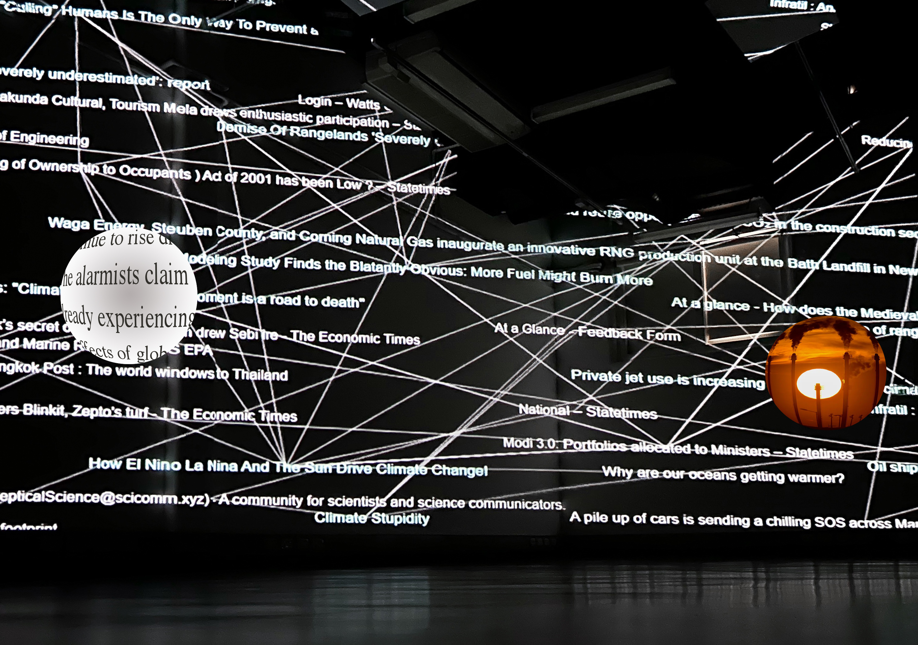

Projection mapped room installation.
This would be similar to my ACMI installation, but it would be a long form video that charts the chronology of news articles
published during the bushfires.
As the visualisation progresses, individual nodes would ‘fisheye’ to display the articles image or an excerpt of text that has
been categorised as expressing a denialist claim.
----------------------------------------------
I have many more ideas for this installation, including different rooms exploring topics such as Think Tanks.
I also would like to experiment with situating works made to date within the exhibition,